JOSEPH HOLLANDER & CRAFT
LANDING PAGE REDESIGN
2025, Freelance
Delivered: Web design, logo design
In late 2025, I was contacted to perform design work for MeanPug, a digital marketing agency that services law firms. My main task was to provide a redesign of the landing page for one of their clients – Joseph Hollander & Craft. Additionally, I was asked to provide a new logo and a polished, cohesive, and clean look for their brand.
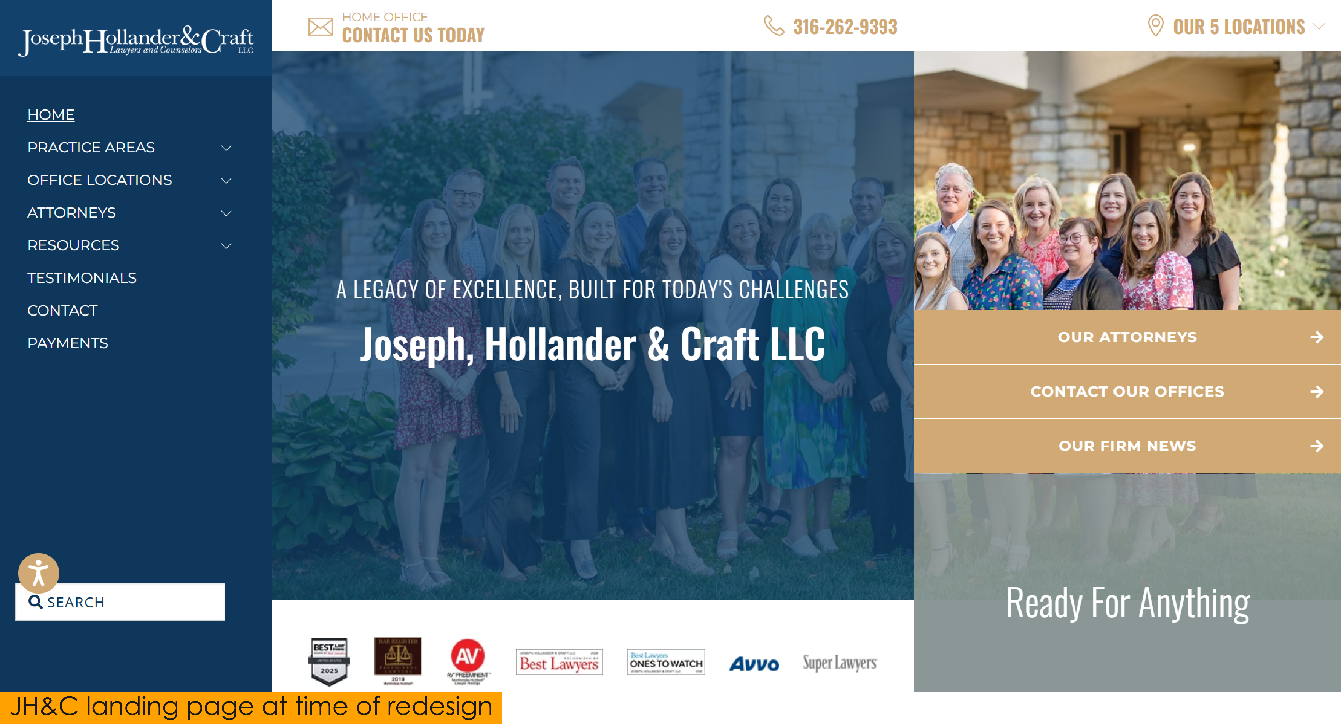
My immediate thought upon seeing their landing page for the first time was that it was far too cluttered. I imagined being in a situation that required legal counsel – an already complex situation to be in – and the thought of navigating to their website for help and being greeted by such visual complexity felt a bit overwhelming. What I felt the page really needed instead was a much more pared back look that felt both uncomplicated and welcoming.
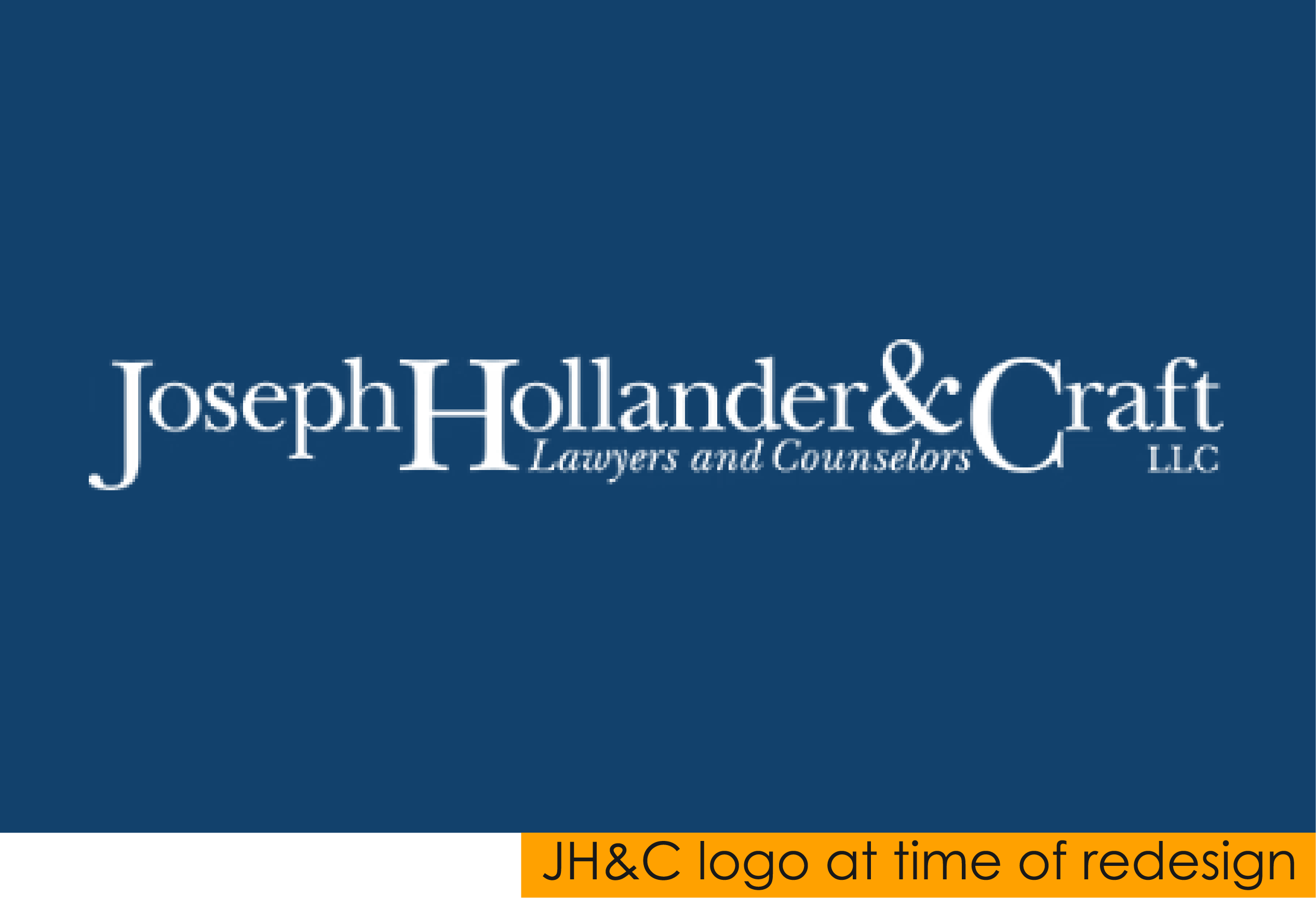
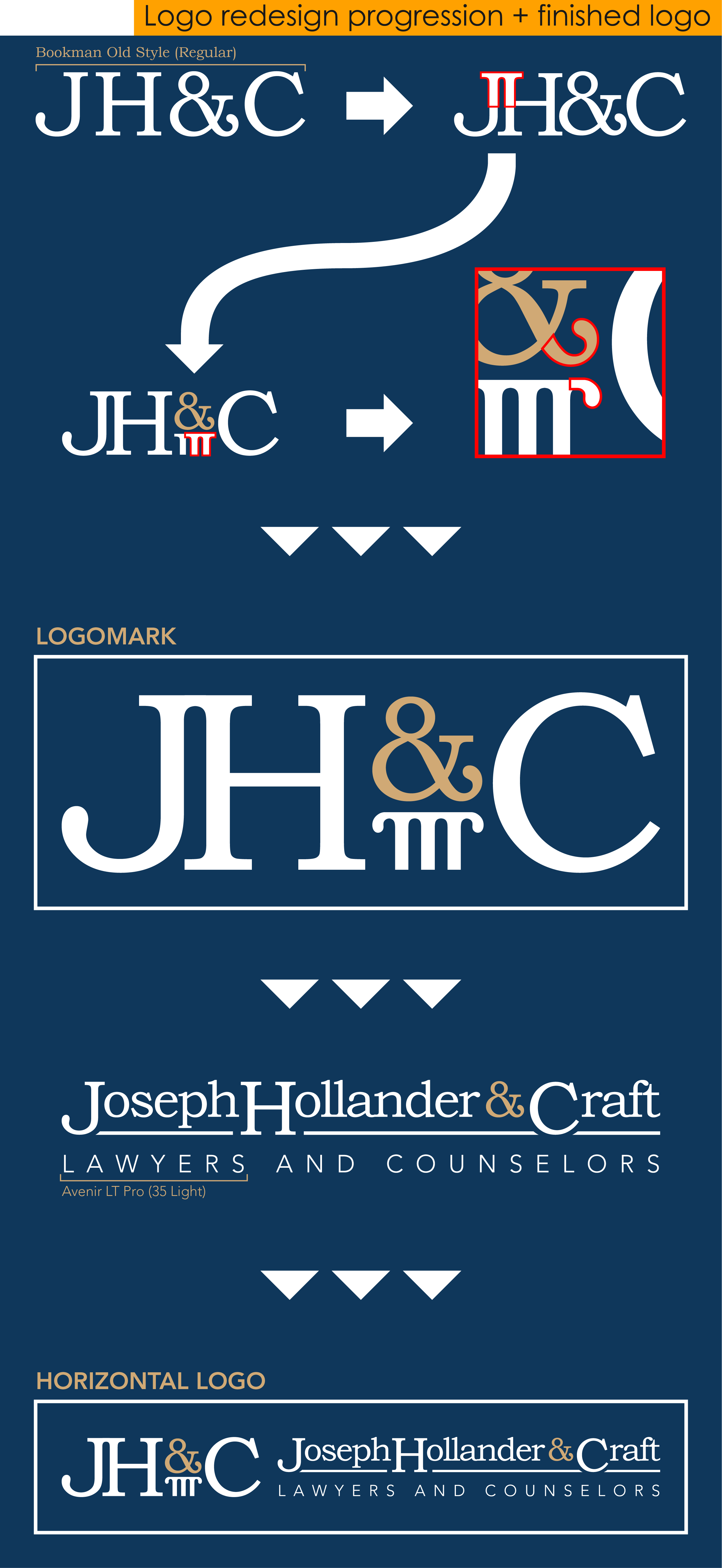
I chose to start by redesigning their logo first, as it would help inform my redesign of the landing page later on. Though I was informed that they were open to exploring other color palette options, I decided to stick with their blue and gold as it gave me a strong and professional impression.
Similarly with the font, while their current logo’s font did provide a strong and professional feel, it did also strike me as a bit outdated. I wanted to keep the strong and professional look that serif fonts typically afford, however, again, I wanted one that simultaneously felt welcoming. I felt as though Bookman Old Style fit this description quite well. Being slightly thicker than the current logo font, it carried some added stregth, but being overall a bit rounder and slightly less formal, it also felt friendlier and almost more modern (ironic given its name!).
I started by condensing the lettering of their initials, which I discovered created what almost looked like a simple graphic of a Greek or Roman pillar between the tops of the ‘J’ and ‘H’. Having also been asked to include an icon in my logo redesign, and not wanting to use the obvious options of a gavel or the Scales of Justice, I figured I could work with this. My next idea was to place the ampersand on top of my new pillar icon and recolor it to add variance. Lastly, I thought it would be good to mirror the rounded shape of the tail of the ampersand in the top ends of the pillar icon, and doing so I felt helped to unify the icon with the letter it was supporting.
Now with my finalized logomark, I simply had to add the full name of the firm along with the “Lawyers and Counselors” subtext to create a horizontal logo that I would use in the header of the webpage. I chose to stick with their current logo’s structure of the ‘J’, ‘H’, and ‘C’ being larger than and extending further below the rest of the lettering, and added a dynamic underline with edges that conformed to the curves of the bottom of the ‘J’ and ‘C’. For the subtext, I selected Avenir LT Pro (Light) as a clean, geometric sans serif contrast to the rest of the lettering in the logo.
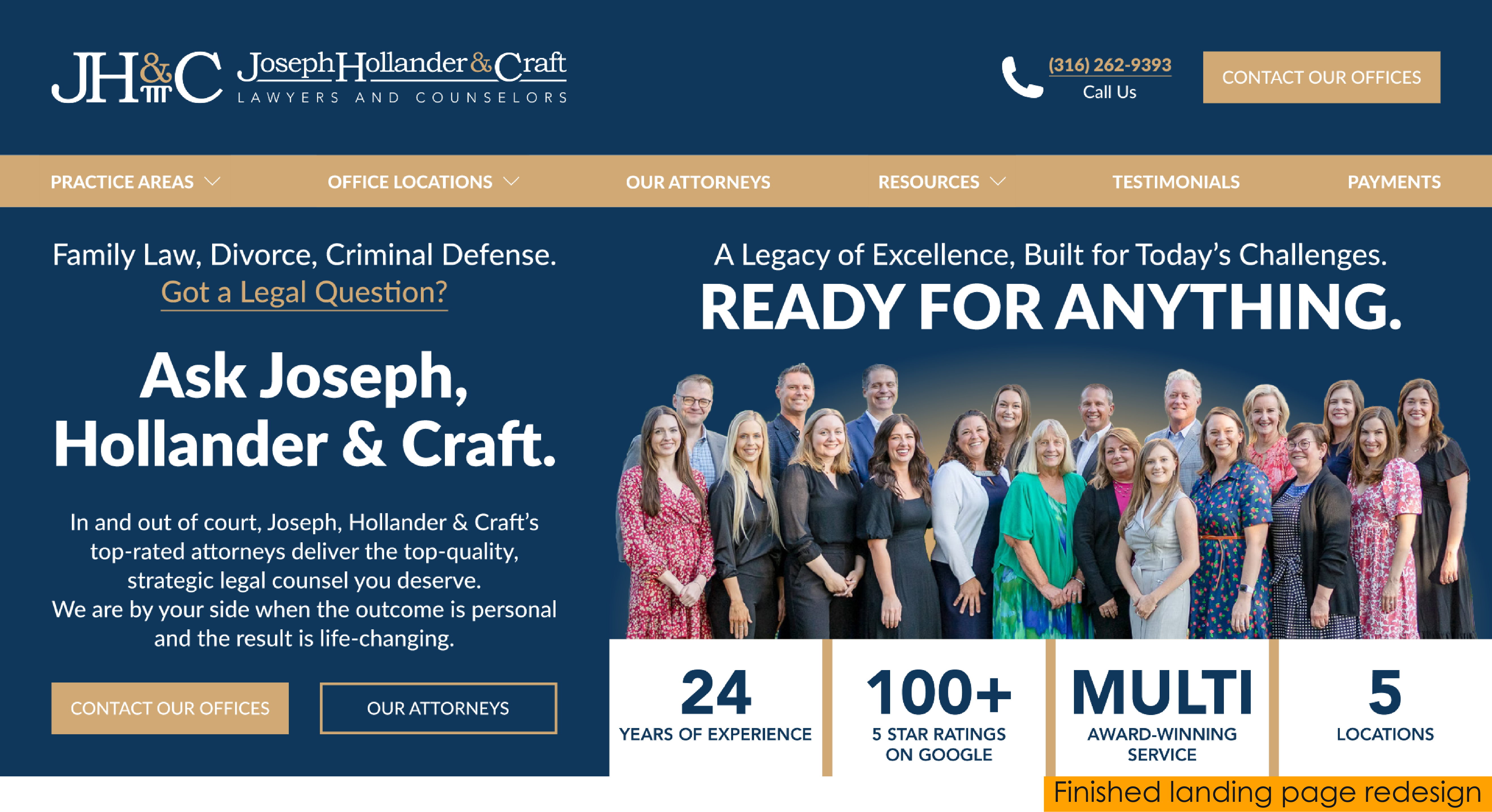
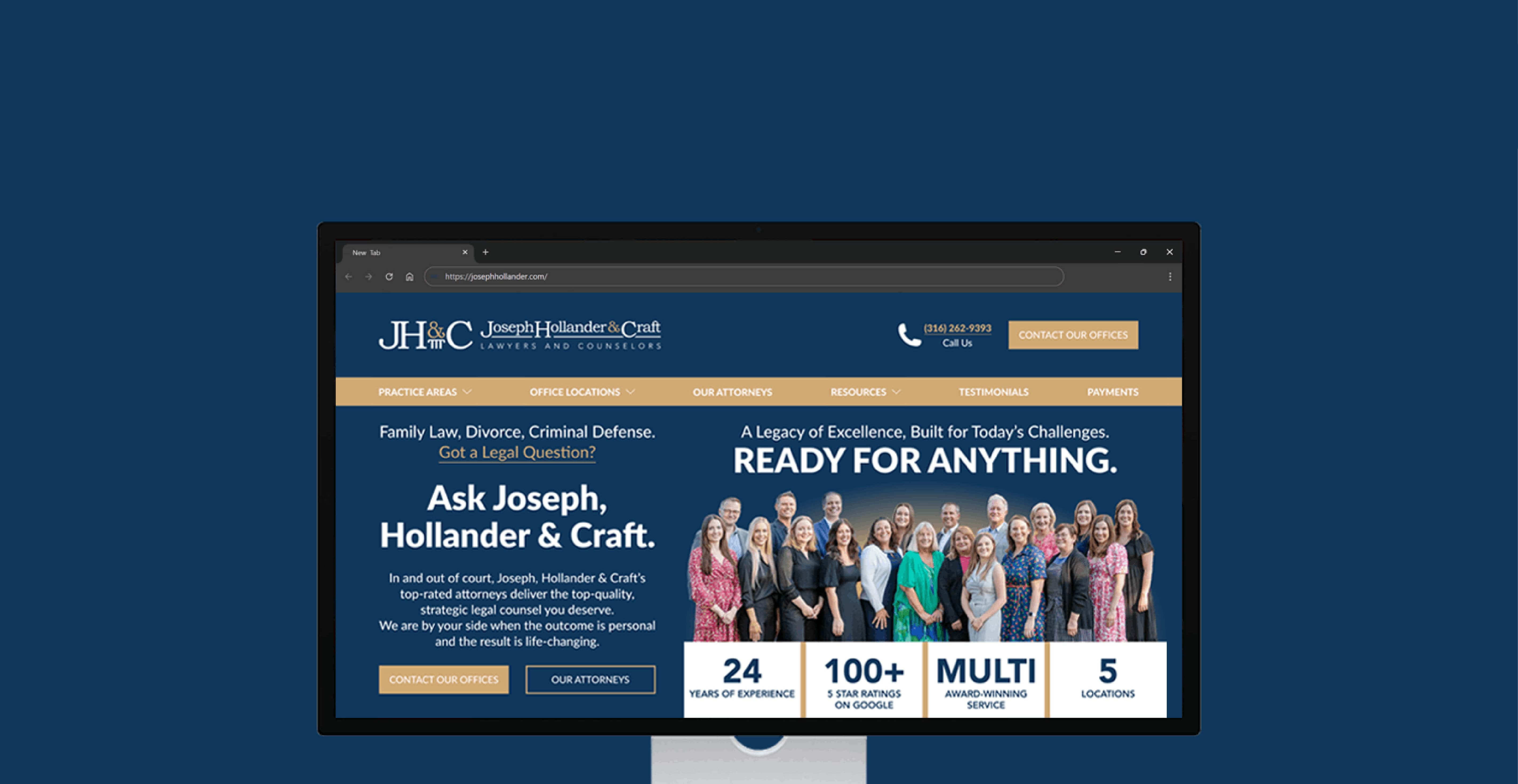
As I stated earlier, my main goal for the landing page was to make it as visually simple as possible, however, I still needed to ensure that I incorporate the five core elements necessary for a high-converting landing page.
1. Unique Selling Proposition
I decided to keep the “Legacy of Excellence...” and “Ready For Anyhting” text already
found on their landing page and tie them together to create something of a USP that I thought would also pair nicely with the hero image that was also already present on the page. Additionally, the text I added to the left third of the page (”In and out of court...”), which I found a bit further down on the home page, provided
a brief and slightly more in-depth explanation of JH&C’s quality of service to further position it as different
and better than the rest.
2. Hero Image
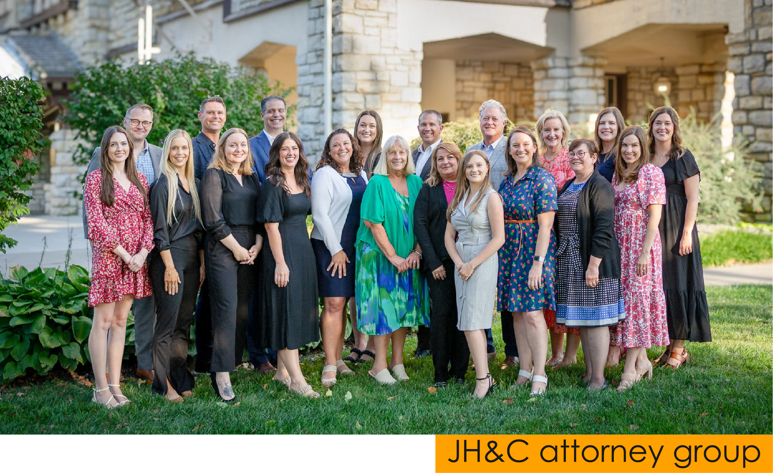
I also kept the hero image already present on the page and added it prominently to my redesign, seeing it as an excellent way to further create a personal and welcoming feeling for entering web traffic by allowing them to immediately see who they would be working with.
3. Benefits of Offering
I felt as though the text on the left third of the page – specifically the line, “We are by your side when the outcome is personal and the result is life-changing.” – along with the social proof I included underneath the hero image sufficed as a brief explanation of the benefits of JH&C’s services.
4. Social Proof
Using some information that I found deeper within their website, along with Google review data for each of the five office locations, I added four different forms of social proof underneath the hero image. For a website advertising legal counsel, I felt as though this type of information was critical, as customers will most certainly want to be assured that the firm they will be receiving counsel from has a strong
reputation – which is why I made this section nearly as prominent as the hero image.
5. Call to Action
The conversion goal for this page was clearly to encourage the customer to contact JH&C’s offices to discuss the legal counsel they required. In addition to plainly marking this call to action with gold buttons (and a dedicated phone number conversion for extra measure) in both the header and landing page
main content, I also included a secondary conversion to view the JH&C team of attorneys.