ELECTRIC FETUS
15TH RECORD STORE DAY
2022, Freelance
Delivered: Logo design, web/social media graphics
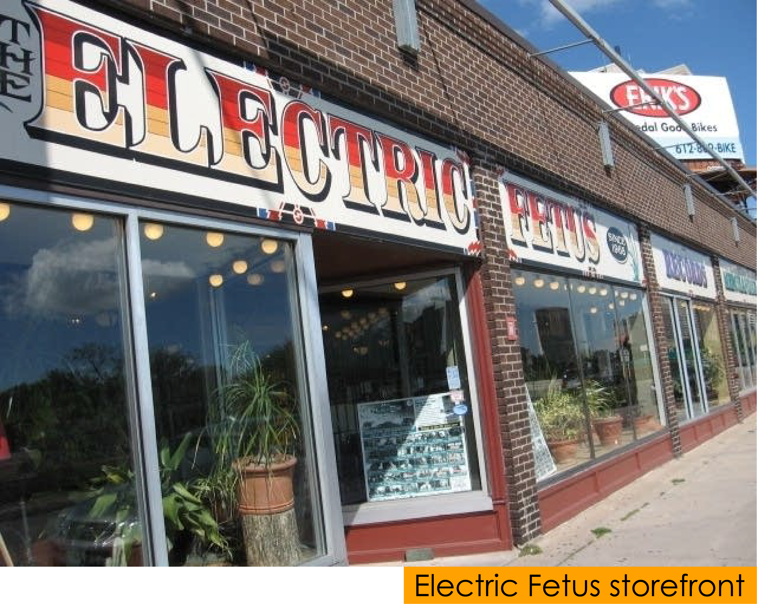
The Electric Fetus is an historic and iconic record store in Minneapolis that has been a cultural hub for music lovers since 1968.
In the Spring of 2022, I had the pleasure of helping to create a logo for their 15th annual celebration of Record Store Day, as well as graphics to be used on their website and social media channels to promote the event.
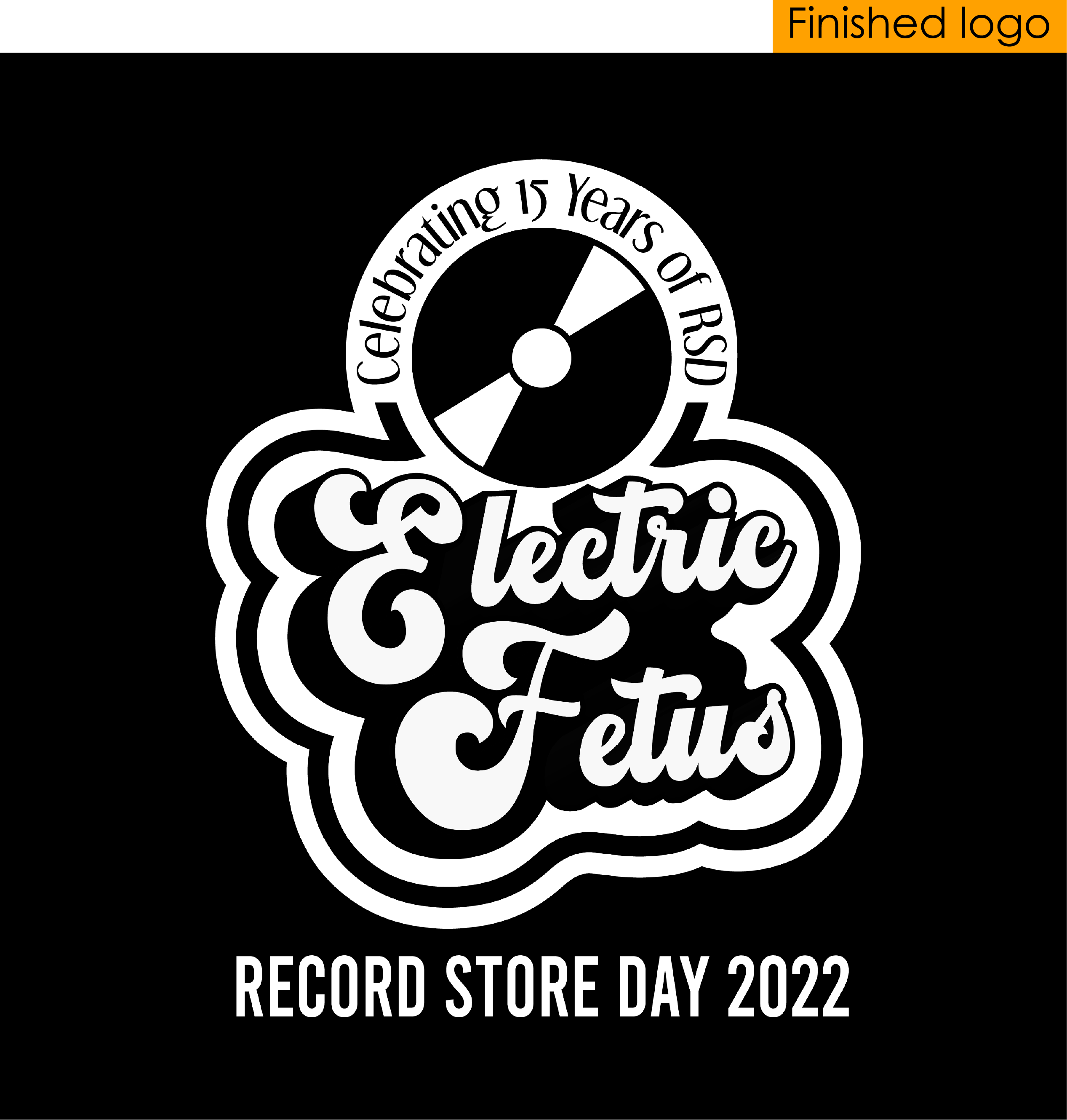
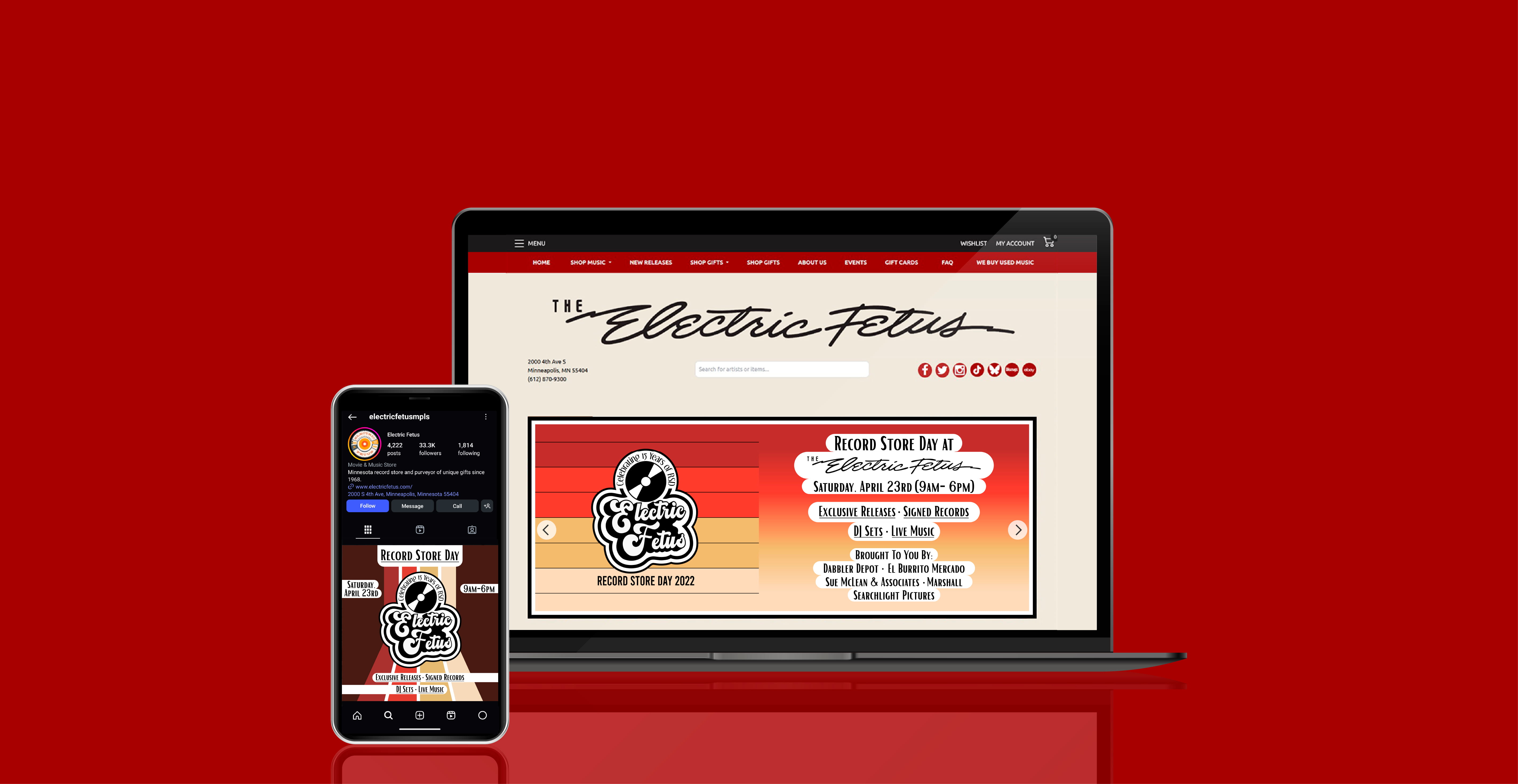
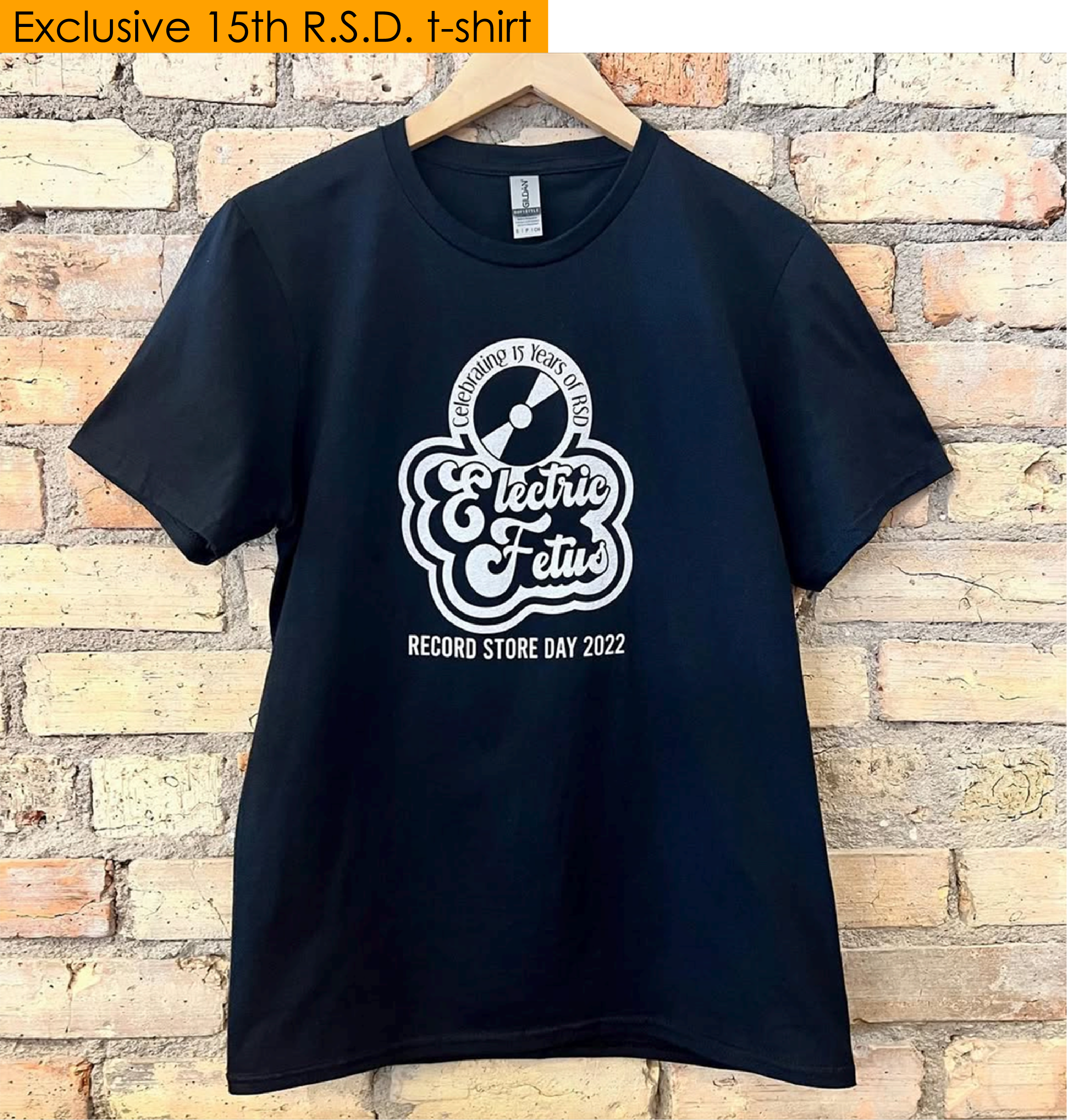
The main goal with the logo was for it to be printed and sold on black, 15th anniversary exclusive t-shirts at the event. However, once the logo was made, management also requested that I use it to produce a banner graphic for their website along with a graphic that could be posted on their social media channels.
Working with the manager of the gifts department at the Fetus, I established a fairly comprehensive understanding of how they wanted the logo to look – from the general shape, to the inclusion of a vinyl record graphic, to the desired font styles. With all of these very helpful details in mind, fortunately, it did not take very long to reach what would be the final design.
The main goal with the logo was for it to be printed and sold on black, 15th anniversary exclusive t-shirts at the event. However, once the logo was made, management also requested that I use it to produce a banner graphic for their website along with a graphic that could be posted on their social media channels.
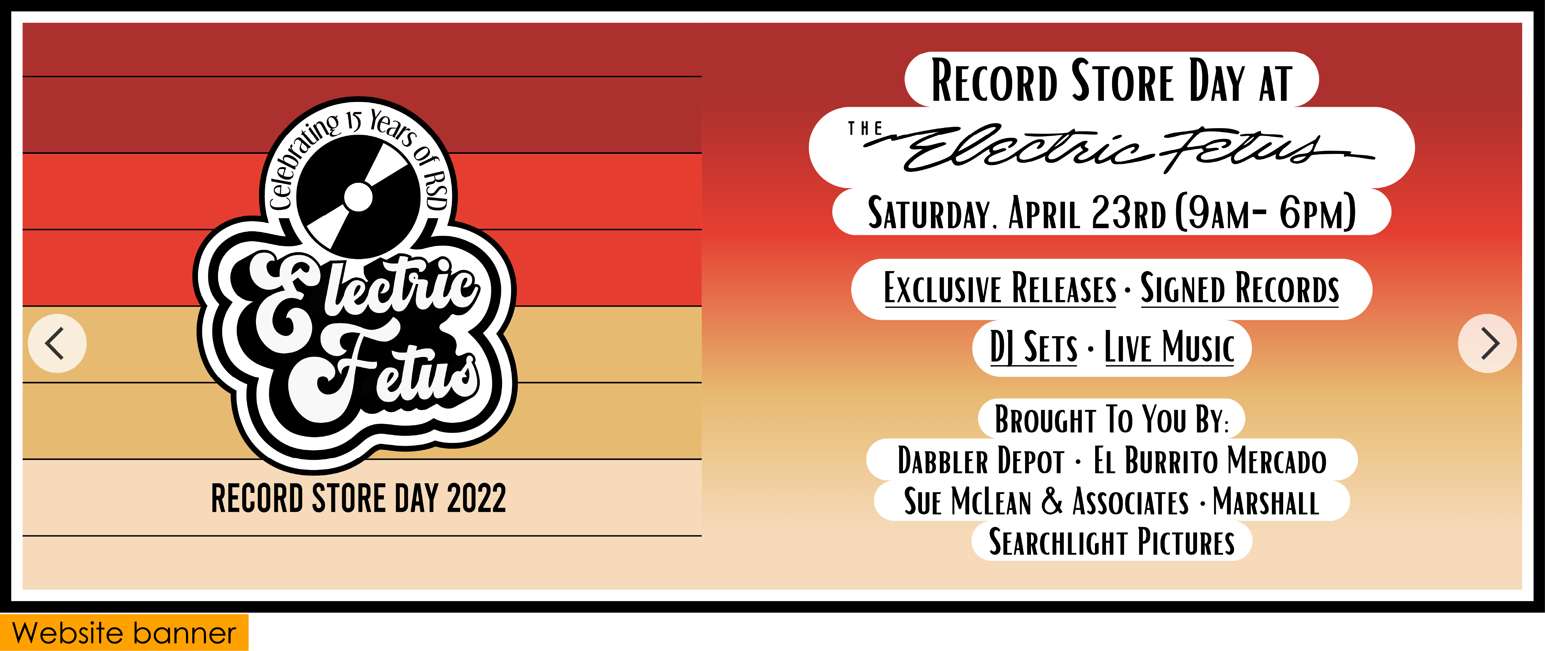
When creating the website banner, I wanted to place the logo on something a little more visually engaging than a solid color background. After playing around with some different ideas, I saw a great opportunity to have the background reflect the bands of color found in the lettering on the storeront signage.
This produced what I found to be a very appealing look that not only created a nice tie-in with their iconic front signage, but also a good contrast between the stark black and white logo and the vibrant bands of color.
I used the same colors of these bands to create a gradient background to place the added informational text on, as it was a much more readable and feasible choice than trying to fit each line of text within the bands. For additional readability, I placed a rounded white background behind each line of text, somewhat mimicking the rounded white background of the logo.
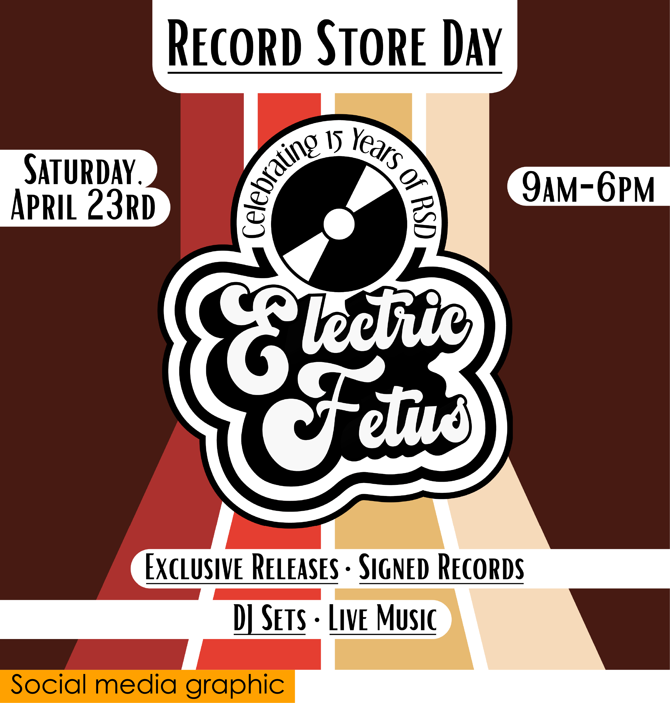
For the social media graphic, I continued the use of the colored bands and the rounded white text backgrounds, but decided to add a little extra visual interest over the website banner by reshaping and redirecting the bands vertically through the logo. I felt that this would appear more visually natural when scrolling vertically through social feeds and would be that much more engaging – something I felt was particularly important, as most people would likely be learning about the event through social posts.
Being a music lover and fan of the Electric Fetus myself, I greatly enjoyed working on this project and found it to be a rewarding new challenge to further develop my skills in designing for web purposes.