BRYANT-LAKE BOWL
LOGO REDESIGN
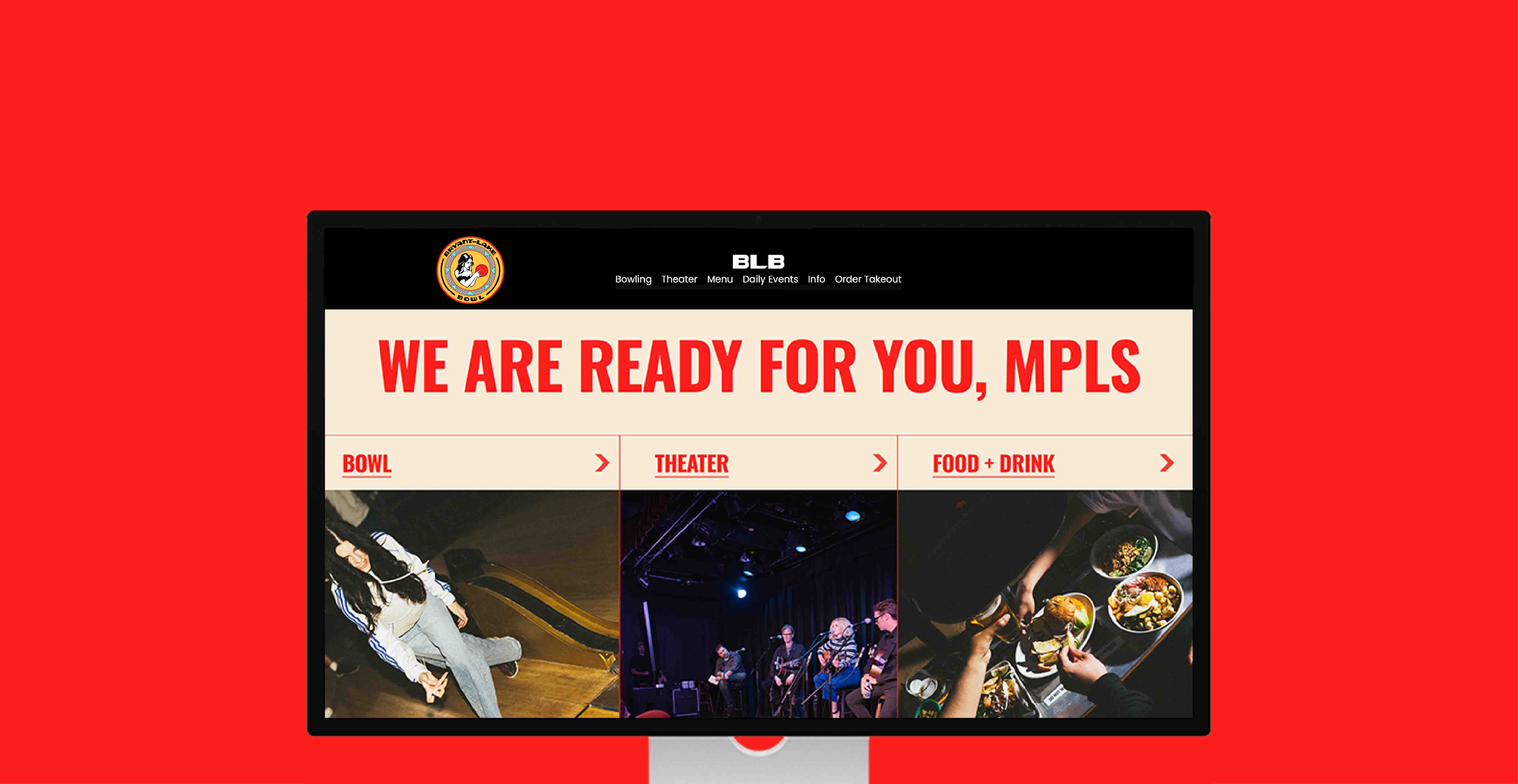
Located in the heart of Uptown Minneapolis, Bryant-Lake Bowl is a neighborhood
destination for vintage bowling, dining, and live entertainment.
As a resident of the Uptown neighborhood in Minneapolis myself, Bryant-Lake Bowl is a personal favorite destination of mine. So, when I decided to perform a speculative logo redesign for a local business near me, BLB stood out as a great candidate.
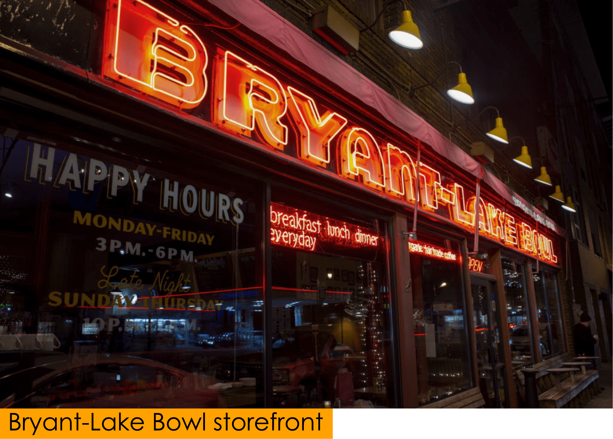
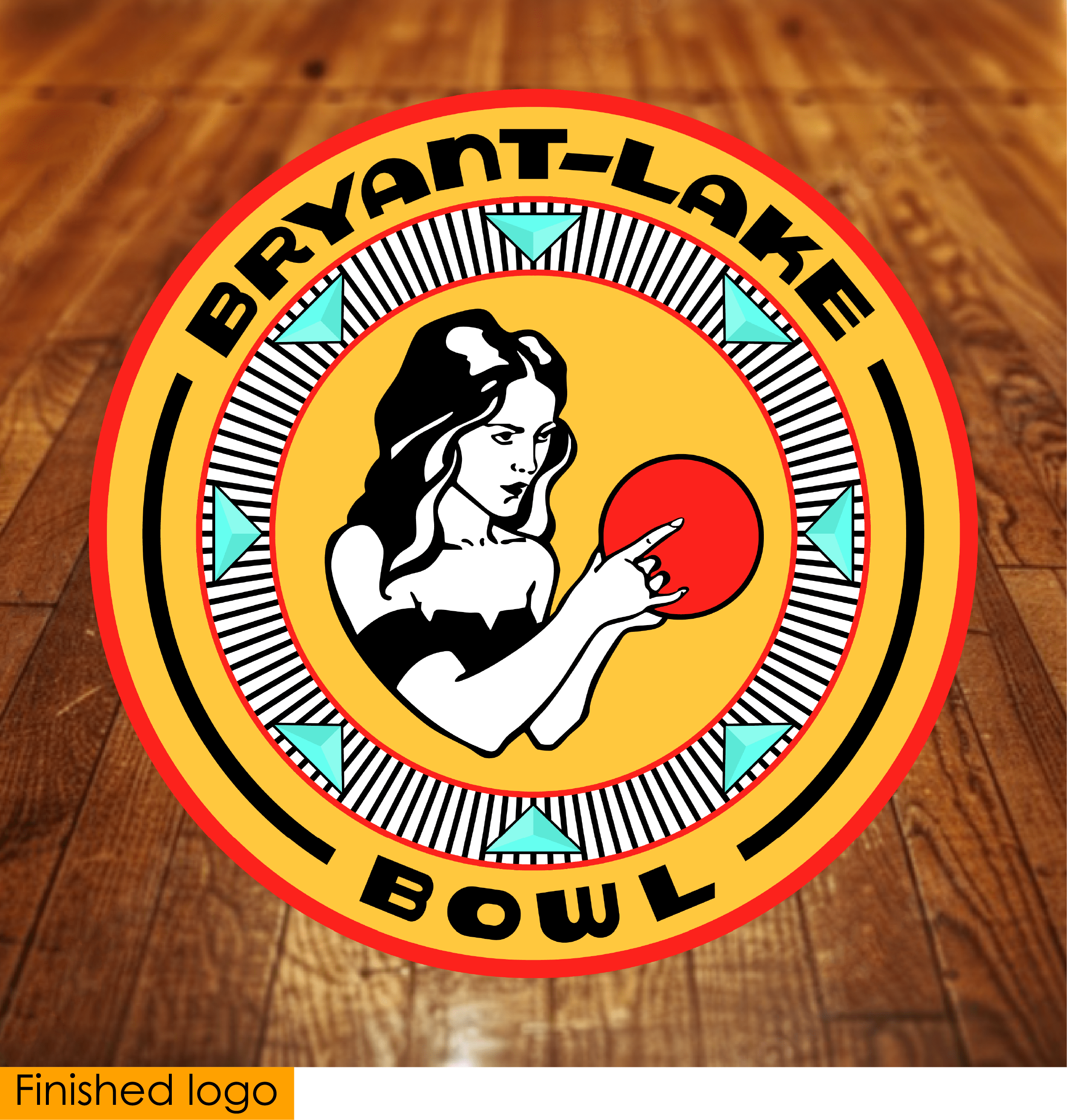
I knew I wanted to keep the red color used in the current logo as I
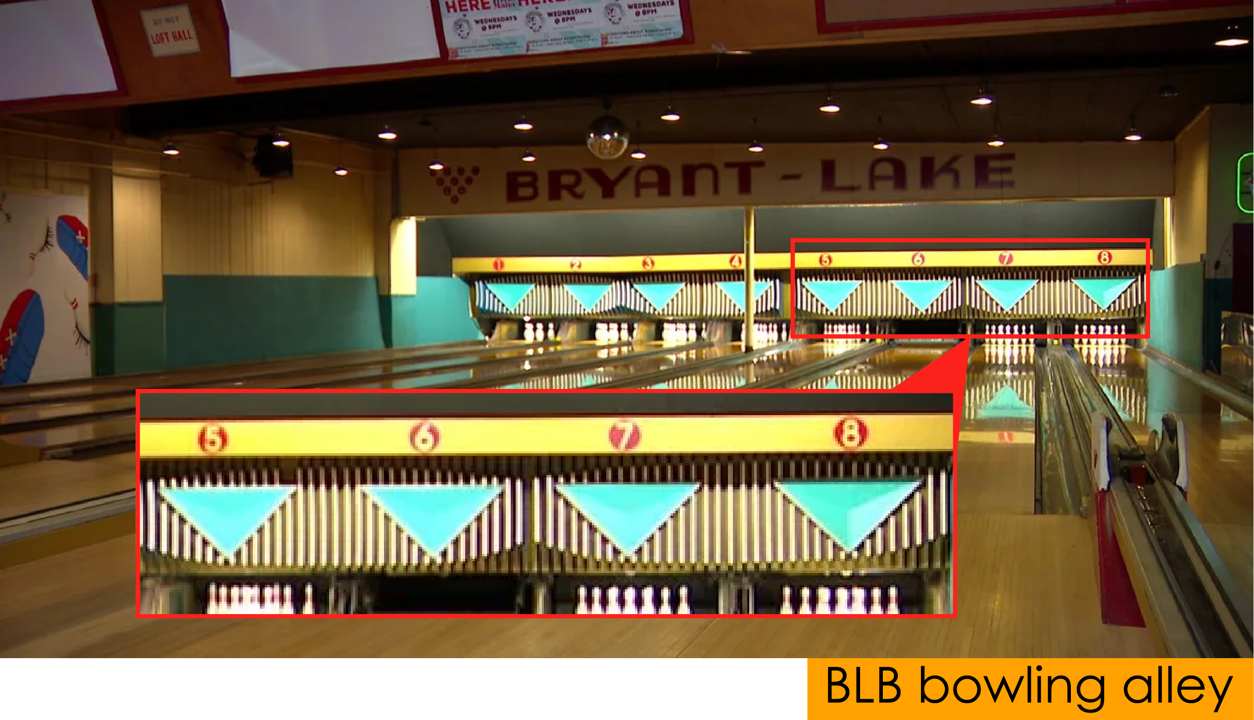
felt it reflected the similarly iconic neon signage on the BLB storefront. Then, when it came time to color the areas of previously white space, I saw a great opportunity to incorporate some of the interior design elements and colors of the bowling alley into the new logo. Namely, the design found directly above each lane including a bue/green almost 3D-like triangle on a black and white pinstripe background, plus the rich yellow color found above that and on the walls. So, the previously white areas were made yellow, while the area that was previously a black and white gradient was changed to a black and white pinstripe background that included eight blue/green triangular designs to symbolize each of the eight available bowling lanes.
I really enjoyed giving this logo a much cleaner and more vibrant look while maintaining the same retro aesthetic that BLB dedicates itself to, while also incorporating some significance into the design.
In addition to my personal favor for BLB, their logo was looking pretty outdated at the
time, making it an even better candidate for an update.
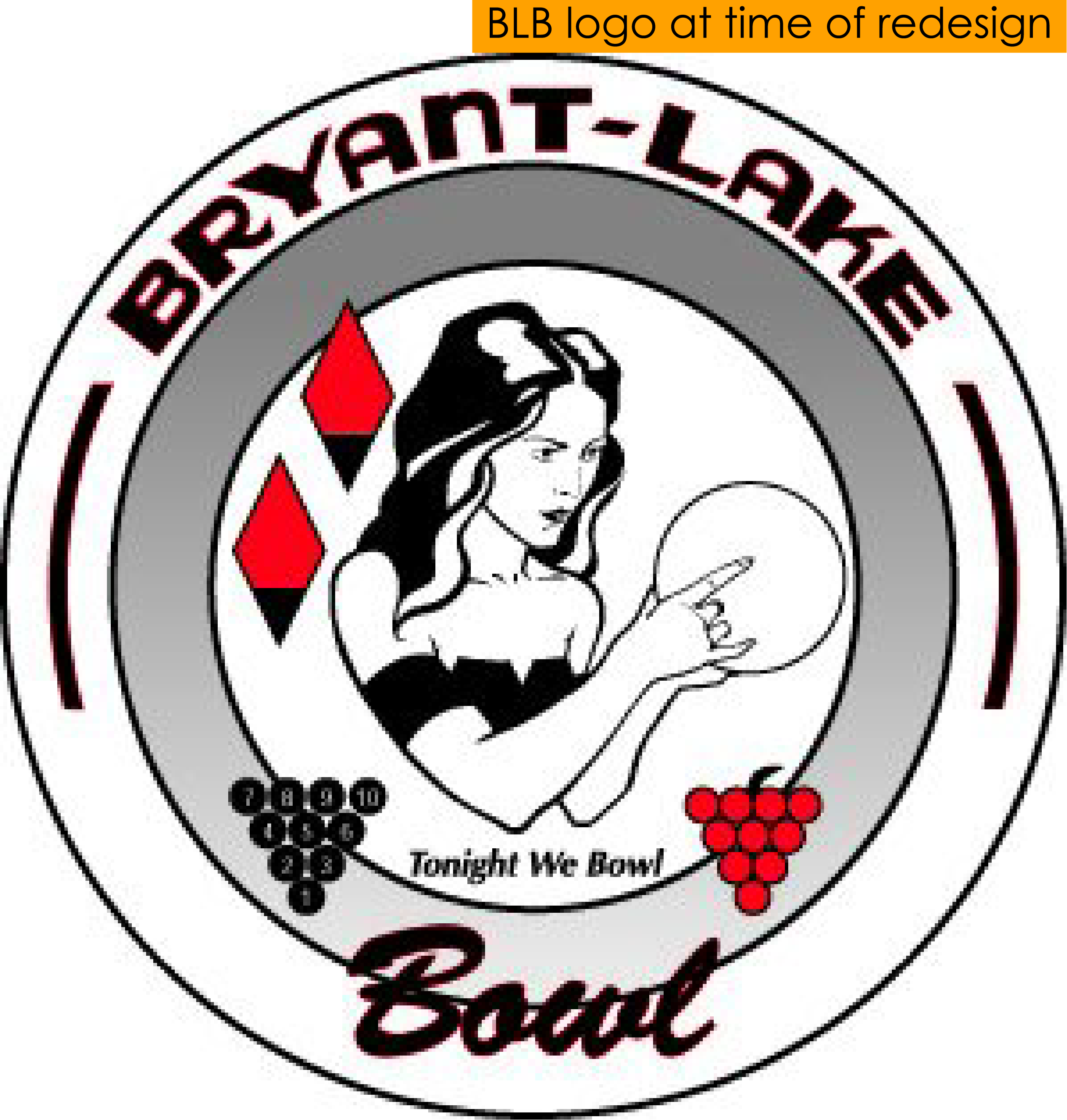
While I appreciated the symmetry of the 10 pin and grape bunch graphic, and that they both had relevance to the establishment, ultimately I decided they would make the logo a little too busy, and so were removed. Similarly, the “Tonight We Bowl” tagline felt unnecessary and only added busy-ness, so it was removed. Lastly, I could not determine the significance of the two red diamond graphics, so these were also removed in the name of minimizing busy-ness, and the font of the “Bowl” text changed to match their iconic “Bryant-Lake” retro ettering to maintain continuity.
In addition to that iconic “Bryant-Lake” lettering, the only other pieces of their current logo I decided to keep were the center female figure and the overall circular shape, as I felt all of these were really the purely fundamental elements of the design. The current logo also struck me as severely lacking color, which I knew absolutley needed to be added to the redesign.
I knew I wanted to keep the red color used in the current logo as I
felt it reflected the similarly iconic neon signage on the BLB storefront. Then, when it came time to color the areas of previously white space, I saw a great opportunity to incorporate some of the interior design elements and colors of the bowling alley into the new logo. Namely, the design found directly above each lane including a bue/green almost 3D-like triangle on a black and white pinstripe background, plus the rich yellow color found above that and on the walls. So, the previously white areas were made yellow, while the area that was previously a black and white gradient was changed to a black and white pinstripe background that included eight blue/green triangular designs to symbolize each of the eight available bowling lanes.
I really enjoyed giving this logo a much cleaner and more vibrant look while maintaining the same retro aesthetic that BLB dedicates itself to, while also incorporating some significance into the design.